

When it comes to creating eye-catching posters, understanding dimensions is key to capturing your audience’s attention. The right size and scale can transform a simple design into a powerful visual statement, whether you’re promoting an event, advertising a business, or sharing important information. However, mastering poster dimensions involves more than just picking a standard size; it requires a deep dive into design principles, visual hierarchy, and even print specifications. In this ultimate guide, we’ll dissect everything you need to know about poster sizes—from common measurements to unique scaling options—and how each choice impacts your design’s effectiveness. Join us as we explore the art and science behind mastering poster dimensions, empowering you to create compelling visuals that not only look stunning but communicate your message clearly and effectively. Get ready to elevate your design game and make every poster a masterpiece!
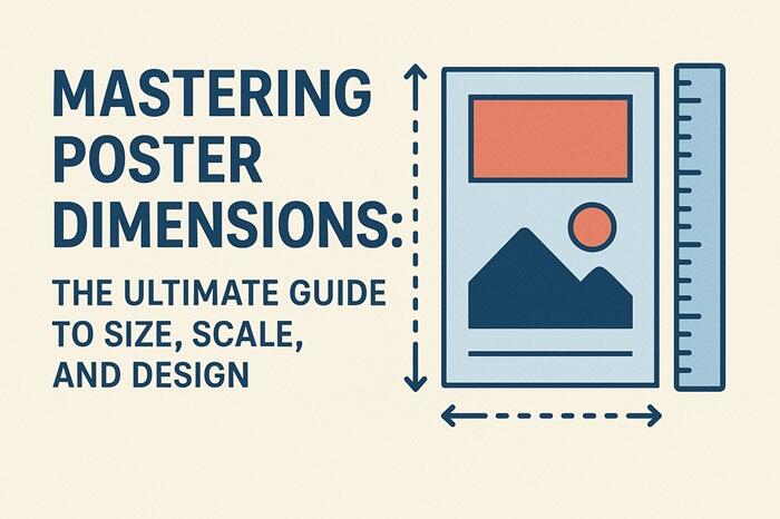
Understanding Poster Dimensions: An Overview
Creating a poster that stands out is an art that hinges significantly on understanding dimensions. Poster dimensions refer to the size and scale of your design, which can drastically affect its impact and readability. At its core, the right dimensions will ensure your poster catches the eye and communicates your message effectively. The dimension choices should be influenced by the poster’s purpose, the space where it will be displayed, and the audience it aims to reach. Dimensions also play a crucial role in the visual hierarchy of the design elements, guiding viewers’ attention to the most important aspects of the message.
To start, it’s important to grasp the concept of aspect ratio, which is the relationship between the width and height of a poster. Common aspect ratios include 4:3, 16:9, and 2:3, each offering a different visual experience. For instance, a 16:9 ratio is typically used for digital displays and video content, providing a widescreen view that can accommodate more information horizontally. On the other hand, a 2:3 ratio might be better suited for artistic posters where vertical space is emphasized. Understanding aspect ratios helps in selecting the right canvas for your design and ensures that your poster maintains its proportion when scaled up or down.
Another key aspect is the orientation of the poster—landscape or portrait. Landscape orientation, where the width is greater than the height, is often used for informational posters, event announcements, or any design that benefits from a wider field of view. Portrait orientation, with a taller height than width, is commonly seen in advertisements, movie posters, and artistic works. The choice between landscape and portrait will depend on the content and how you want it presented. Knowing these basics will allow you to make informed decisions as you delve deeper into poster design.
Standard Poster Sizes and Their Uses
When selecting a poster size, it’s essential to consider the industry’s standard dimensions, which have been established based on common usage and practicality. Standard poster sizes ensure compatibility with printing services and display fixtures, making it easier to produce and distribute your designs. The most common sizes include A4, A3, A2, A1, and A0, each serving different purposes and contexts.
A4 (210 x 297 mm) is the smallest standard size and is typically used for flyers, small advertisements, and notices. Its compact size makes it easy to distribute and display in various settings, but it limits the amount of information that can be effectively presented. A4 posters are ideal for concise messages and simple designs that do not require extensive detail.
A3 (297 x 420 mm) offers a slightly larger canvas, providing more space for design elements and text. This size is often used for indoor advertisements, promotional materials, and event posters. It strikes a balance between portability and visibility, making it a versatile choice for many applications.
A2 (420 x 594 mm) is where posters start to make a significant visual impact. This size is commonly used for movie posters, event promotions, and retail advertisements. The increased space allows for more intricate designs and larger text, which can attract attention from a distance.
A1 (594 x 841 mm) and A0 (841 x 1189 mm) are the largest standard sizes, suitable for outdoor advertising, large-scale event promotions, and exhibitions. These sizes offer ample space for detailed graphics, comprehensive information, and bold statements, ensuring that your poster stands out in crowded environments. Choosing the right standard size will depend on the intended use and the environment in which the poster will be displayed.
Choosing the Right Size for Your Audience
Understanding your audience is crucial when determining the appropriate poster size. Different audiences have varying preferences and needs, which should be reflected in your design choices. The right size will ensure that your message is accessible and engaging for your target demographic, whether you’re aiming to capture the attention of passersby on a busy street or inform attendees at a conference.
For instance, if your audience consists of commuters in a bustling urban area, larger posters such as A1 or A0 are ideal. These sizes provide maximum visibility from a distance, making it easier for people to notice and absorb the information while on the move. The design should be bold and straightforward, with minimal text and prominent visuals to quickly convey the message.
Conversely, if your audience is attending a small community event or a local exhibition, smaller sizes like A3 or A2 may be more appropriate. These settings allow for closer interaction with the poster, so you can incorporate more detailed information and intricate designs. The key is to create a balance between readability and aesthetic appeal, ensuring that the poster captures attention without overwhelming the viewer.
Additionally, consider the age and interests of your audience. Younger audiences might prefer vibrant, dynamic designs with modern aesthetics, while older demographics might appreciate classic, clear layouts with easily readable fonts. Tailoring the size and design elements to your audience’s preferences will enhance the effectiveness of your poster and ensure that your message resonates.
The Importance of Scale in Poster Design
Scale is a fundamental principle in poster design that affects how elements are perceived and interacted with. Proper scaling ensures that each component of your design—from text to images—is appropriately sized to create a cohesive and impactful visual experience. Mastering scale involves understanding the relationship between different design elements and how they contribute to the overall message.
The first aspect of scale to consider is the hierarchy of information. Your poster should guide the viewer’s eye through the content in a logical and engaging manner. This is achieved by scaling key elements such as headlines, images, and calls to action larger than supporting details. For example, the title of your event should be the most prominent feature on the poster, followed by the date, location, and other pertinent information. This hierarchy helps viewers quickly identify the most important aspects of the message.
Images play a significant role in poster design, and their scale can dramatically influence the poster’s visual impact. Large, high-quality images can capture attention and evoke emotions, making them ideal for focal points. However, it’s essential to ensure that images are scaled appropriately to avoid pixelation and maintain clarity. Smaller images can be used to support the main visual, providing additional context or enhancing the overall aesthetic.
Text scaling is another critical consideration. The font size should be chosen based on the distance from which the poster will be viewed. For posters intended for close inspection, smaller text can be used to convey detailed information. For those meant to be seen from afar, larger, bold fonts are necessary to ensure readability. Consistency in text scaling across different elements will create a harmonious and professional look.
Design Principles for Effective Poster Layout
Effective poster design goes beyond choosing the right size and scale; it involves applying design principles that enhance visual appeal and communication. These principles include balance, contrast, alignment, and proximity, each contributing to a cohesive and engaging layout.
Balance refers to the distribution of visual weight across the poster. A balanced design feels stable and aesthetically pleasing, while an unbalanced layout can appear chaotic and disjointed. Achieving balance involves arranging elements symmetrically or asymmetrically to create a sense of harmony. Symmetrical balance involves mirroring elements on either side of a central axis, while asymmetrical balance uses varying sizes and positions to achieve equilibrium. Both approaches can be effective, depending on the desired visual impact.
Contrast is essential for highlighting key elements and ensuring readability. High contrast between text and background colors makes information stand out and easy to read. Contrast can also be achieved through size, shape, and texture differences. For example, pairing bold headlines with lighter subtext creates a visual hierarchy that guides the viewer’s attention. Effective use of contrast will make your poster visually dynamic and engaging.
Alignment ensures that elements are organized and positioned in a way that creates a clean and professional look. Consistent alignment of text, images, and other components creates a sense of order and helps the viewer navigate the content. Grid systems are commonly used to achieve precise alignment, dividing the poster into sections where elements can be placed systematically. Proper alignment enhances the overall structure and flow of the design.
Proximity involves grouping related elements together to create a visual connection. Placing related information close together helps the viewer understand the relationship between different parts of the poster. For instance, the event title, date, and location should be positioned near each other, forming a cohesive block of information. Effective use of proximity reduces clutter and enhances the poster’s readability.
Common Mistakes in Poster Sizing and Design
Despite the best intentions, common mistakes in poster sizing and design can hinder the effectiveness of your message and visual appeal. Recognizing and avoiding these pitfalls will help you create polished and impactful posters.
One frequent mistake is overcrowding the poster with too much information. While it’s tempting to include as much detail as possible, excessive text and images can overwhelm the viewer and dilute the message. Instead, focus on the essentials and use concise, clear language. Prioritize the most important information and use visual hierarchy to guide the viewer’s attention.
Another common error is neglecting readability. Small text, intricate fonts, and poor color contrast can make your poster difficult to read, especially from a distance. Ensure that your text is large enough to be legible and choose fonts that are easy to read. High contrast between text and background colors will enhance readability and make your poster more accessible.
Ignoring the context of display can also compromise your poster’s effectiveness. Consider where and how your poster will be viewed—indoors or outdoors, close-up or from afar. The environment should influence your design choices, including size, scale, and color scheme. For example, outdoor posters need to be larger and more vibrant to stand out in busy settings, while indoor posters can afford to be more detailed and subtle.
Lastly, inconsistent scaling and alignment can create a disjointed and unprofessional look. Ensure that all elements are scaled proportionately and aligned consistently. Use grid systems to maintain order and structure, and double-check that images are high resolution to avoid pixelation. Attention to detail in scaling and alignment will enhance the overall quality of your poster.
Tips for Printing Posters in Various Sizes
Printing posters in various sizes requires attention to detail and an understanding of print specifications to ensure the final product meets your expectations. Here are some essential tips to guide you through the printing process.
First, choose the right paper type and weight for your poster. The paper should be durable enough to withstand handling and display conditions, but also suitable for your design’s aesthetic. Common options include glossy, matte, and satin finishes, each offering different visual effects. Glossy paper enhances colors and contrasts, making it ideal for vibrant designs. Matte paper reduces glare and is suitable for detailed information, while satin provides a balance between the two.
Resolution is crucial for maintaining the quality of your design when printed. Ensure that your images and graphics are high resolution (at least 300 DPI) to avoid pixelation and blurriness. This is especially important for larger posters, where low-resolution elements can become noticeably distorted. Always check the resolution settings before finalizing your design.
Color accuracy is another important consideration. The colors on your screen may not always match the printed output due to differences in color profiles and printing technology. Use CMYK color mode for print designs, as this is the standard for most printers. Consider doing a test print or proof to check color accuracy and make any necessary adjustments.
Finally, consider the bleed and trim areas in your design. Bleed refers to the extra space around the edges of your design that will be trimmed off during printing. Including a bleed ensures that there are no white borders around your poster and that the design extends to the edges. Typically, a bleed of 3-5 mm is recommended. Make sure important elements are not placed too close to the edges to avoid being cut off.
Digital vs. Print: Adapting Poster Dimensions
The rise of digital media has transformed the way posters are designed and displayed, necessitating adaptations in dimensions and format. Understanding the differences between digital and print posters will help you create effective designs for both mediums.
Digital posters are often viewed on screens, which means they can take advantage of dynamic elements such as animations and interactive features. These posters need to be designed with screen resolution and aspect ratios in mind. Common digital display sizes include 1080p (1920 x 1080 pixels) and 4K (3840 x 2160 pixels), which provide high-definition visuals. It’s important to optimize your design for different screen sizes and resolutions to ensure it looks good on various devices.
Print posters, on the other hand, require attention to physical dimensions and print specifications. As discussed earlier, standard sizes such as A4, A3, A2, A1, and A0 are commonly used. Print posters benefit from high-resolution images and precise color management to maintain quality. Unlike digital posters, print designs need to account for bleed and trim areas, ensuring that the final product is correctly aligned and formatted.
Another key difference is the viewing context. Digital posters are often seen on websites, social media, and digital billboards, where viewers can interact with the content. Print posters are static and need to capture attention through visual impact alone. This means that digital posters can include more detailed information and interactive elements, while print posters should focus on bold visuals and concise messaging.
Adapting your design for digital and print formats requires flexibility and attention to detail. Ensure that your design elements are scalable and maintain quality across different mediums. Test your digital posters on various devices to check for consistency, and proof your print posters to verify color accuracy and alignment. By understanding the unique requirements of each format, you can create compelling designs that work effectively in both digital and print environments.
Tools and Resources for Designing Posters
Designing posters requires a combination of creativity and technical skills, supported by various tools and resources that can enhance your workflow and quality. Here are some essential tools and resources to consider.
Graphic design software is the foundation of poster creation. Popular options include Adobe Photoshop, Illustrator, and InDesign, each offering robust features for designing and editing. Photoshop is ideal for image manipulation and complex effects, while Illustrator excels in vector graphics and scalability. InDesign is perfect for layout design and text formatting, making it a comprehensive tool for poster creation.
Online design platforms such as Canva and Crello provide user-friendly interfaces and pre-made templates, suitable for beginners and quick projects. These platforms offer a wide range of customization options and design elements, allowing you to create professional posters with ease. They also include features for collaboration and sharing, making it convenient for team projects.
Stock image libraries like Shutterstock, Unsplash, and Pexels provide high-quality images and graphics that can enhance your design. These libraries offer a vast selection of free and paid resources, ensuring that you can find the right visuals for your poster. Using high-resolution images from trusted sources will improve the overall quality and impact of your design.
Typography resources are essential for selecting and managing fonts. Websites like Google Fonts, DaFont, and FontSquirrel offer a wide range of free and premium fonts, suitable for various design styles. Experimenting with different fonts and combinations will help you create a unique and readable poster.
Color tools such as Adobe Color and Coolors can assist in choosing and harmonizing color palettes. These tools allow you to experiment with different color schemes and find combinations that work well together. Consistent and appealing color choices will enhance the visual appeal of your poster.
Finally, print services and online marketplaces like Vistaprint, Printful, and Redbubble offer professional printing and distribution options. These services ensure that your posters are printed to high standards and can be shared with a wider audience. Utilizing reliable print services will save time and guarantee quality.
Conclusion: Elevating Your Poster Design Skills
Mastering poster dimensions and design principles is a journey that combines creativity, technical knowledge, and attention to detail. Understanding the impact of size, scale, and layout will empower you to create visually stunning and effective posters that capture attention and communicate your message clearly.
By exploring standard poster sizes and their uses, you can make informed decisions based on the context and audience. Recognizing the importance of scale in design helps in creating a balanced and engaging visual hierarchy. Applying design principles such as balance, contrast, alignment, and proximity ensures a cohesive and professional layout.
Avoiding common mistakes and considering print specifications will enhance the quality of your posters. Adapting designs for digital and print formats requires flexibility and optimization for different mediums. Utilizing various tools and resources will streamline your workflow and improve your design skills.
Ultimately, elevating your poster design skills involves continuous learning and experimentation. Stay updated with design trends and technologies, and don’t be afraid to try new techniques. With dedication and creativity, you can transform every poster into a masterpiece that stands out and delivers your message effectively.
Embrace the art and science of poster design, and let your creativity shine through every project. Whether you’re promoting an event, advertising a business, or sharing important information, mastering poster dimensions will help you create compelling visuals that leave a lasting impression.